We used many different types of
typical conventions of music videos.
typical conventions of music videos.
At the beginning of our music video
it starts off with a close up of of the guitar and drums and this is similar to what most rock bands do. We did this as at the beginning of the music video as the music starts off with a guitar and drums playing for about 8 seconds before the lyrics kick in.
When we were deciding what to do for the opening of the song we came across some ideas that included opening with the narrative or just have it blank until the lyrics kicked in although this idea we quickly decided was bad as it would just look bad. In the end we thought that this was the best idea and decided to keep with it.
Here is an example of a famous band using close ups of the guitar and drums in their music video. This is the song The Pretender by Foo Fighters, close ups of guitar and drums are often used in rock song but can be used in other
music genres.

Another popular convention we used in our music video is a close up of the singer. This is a very popular shot used in music videos as it shows off the singer but we used it to show the lip syncing as we needed to show the singer lip syncing to the song. To make sure that the singer knows what the lyrics are we played the song in the background so he can keep track of where he was.
This is an example of the band Foo Fighters and is the same song as before (The Pretenders). They use close ups of the singer quite a few times during the course of this song.
This is the magazine advert we created for our band this isn't as good as many other as but we did use some of the typical conventions used of magazines these were the name of the band and the popular song. Also we put on a website link so people would be able to go to our site.
What we were going to do to improve our final piece was change the background as it doesn't work with the image and change the layout of the logos and writing as it looked to cramped at the top.

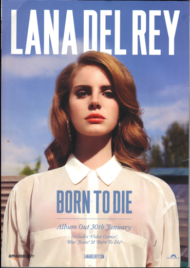
Here are some examples of magazine covers the
first one is for the song Born to die by singer
Lana Del Rey as you can see the advert is very
simplistic. This magazine advert has not much information on it except at the top the name of the singer and below is an image of the singer which takes up most of the magazine advert. near the bottom it says the name of the song which is Born to die and underneath that in smaller writing when the album is out. This magazine advert starts with the most important thing in big bold letters which is the singers name and then the less important the information the smaller the writing.

After working on our magazine we decided to start a new one and this is the end result we thought this was better than our old one so we made this our final piece. What we did to improve our magazine is one change the layout and it looks a lot better with the new layout we put the logos at the bottom and then above them we put in reviews of the song and above that is the name of the band and the song. On the side of is the website for the band and next to it is and image/silhouette of the band members we thought it looked better like this as the image didn't fit in with the magazine but the shadow does. We followed a few key conventions like the most important writing be the biggest on the page and that was the band name and song and the writing got smaller for the less important stuff like website and reviews.

This is our final digipack and what we decided to do was have images of the band members be on the digipack. The front of the digipack had the band together and the back had a picture of the sky. the disc page also had another image of the band but a different image and the other 3 pages were shots of the band members. This followed key conventions as many digipacks use images of the band on their main images.
When we were deciding what to do for the opening of the song we came across some ideas that included opening with the narrative or just have it blank until the lyrics kicked in although this idea we quickly decided was bad as it would just look bad. In the end we thought that this was the best idea and decided to keep with it.
Here is an example of a famous band using close ups of the guitar and drums in their music video. This is the song The Pretender by Foo Fighters, close ups of guitar and drums are often used in rock song but can be used in other
music genres.

Another popular convention we used in our music video is a close up of the singer. This is a very popular shot used in music videos as it shows off the singer but we used it to show the lip syncing as we needed to show the singer lip syncing to the song. To make sure that the singer knows what the lyrics are we played the song in the background so he can keep track of where he was.
This is an example of the band Foo Fighters and is the same song as before (The Pretenders). They use close ups of the singer quite a few times during the course of this song.
This is the magazine advert we created for our band this isn't as good as many other as but we did use some of the typical conventions used of magazines these were the name of the band and the popular song. Also we put on a website link so people would be able to go to our site.
What we were going to do to improve our final piece was change the background as it doesn't work with the image and change the layout of the logos and writing as it looked to cramped at the top.

Here are some examples of magazine covers the
first one is for the song Born to die by singer
Lana Del Rey as you can see the advert is very
simplistic. This magazine advert has not much information on it except at the top the name of the singer and below is an image of the singer which takes up most of the magazine advert. near the bottom it says the name of the song which is Born to die and underneath that in smaller writing when the album is out. This magazine advert starts with the most important thing in big bold letters which is the singers name and then the less important the information the smaller the writing.

After working on our magazine we decided to start a new one and this is the end result we thought this was better than our old one so we made this our final piece. What we did to improve our magazine is one change the layout and it looks a lot better with the new layout we put the logos at the bottom and then above them we put in reviews of the song and above that is the name of the band and the song. On the side of is the website for the band and next to it is and image/silhouette of the band members we thought it looked better like this as the image didn't fit in with the magazine but the shadow does. We followed a few key conventions like the most important writing be the biggest on the page and that was the band name and song and the writing got smaller for the less important stuff like website and reviews.

This is our final digipack and what we decided to do was have images of the band members be on the digipack. The front of the digipack had the band together and the back had a picture of the sky. the disc page also had another image of the band but a different image and the other 3 pages were shots of the band members. This followed key conventions as many digipacks use images of the band on their main images.


No comments:
Post a Comment